Thoughts on the Latest Music App Update from Apple

How Apple's Latest IOS Music App Failed to Impress
As a heavy user of Apple's IOS music app, I, along with many users, waited with baited breath for their latest fix and update to the Cuppertino company's nine year old music player. Although this latest update includes much needed technical fixes, this article will focus mainly on Apples' changes to the user interface and overall design. While there many things I disliked about Apple's previous version, at least it was somewhat useable and went along with the company's vison of simplicity and ease of use - mostly. Unfortunately, version 10 not only seems to add more issues to the mix, the UI (user interface) seemed to make the user experience not only frustrating, but downright unuseable at times.
So you ask "What has gotten you so upset?" Well, let's start with a few basics, shall we?
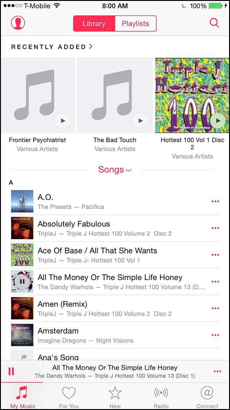
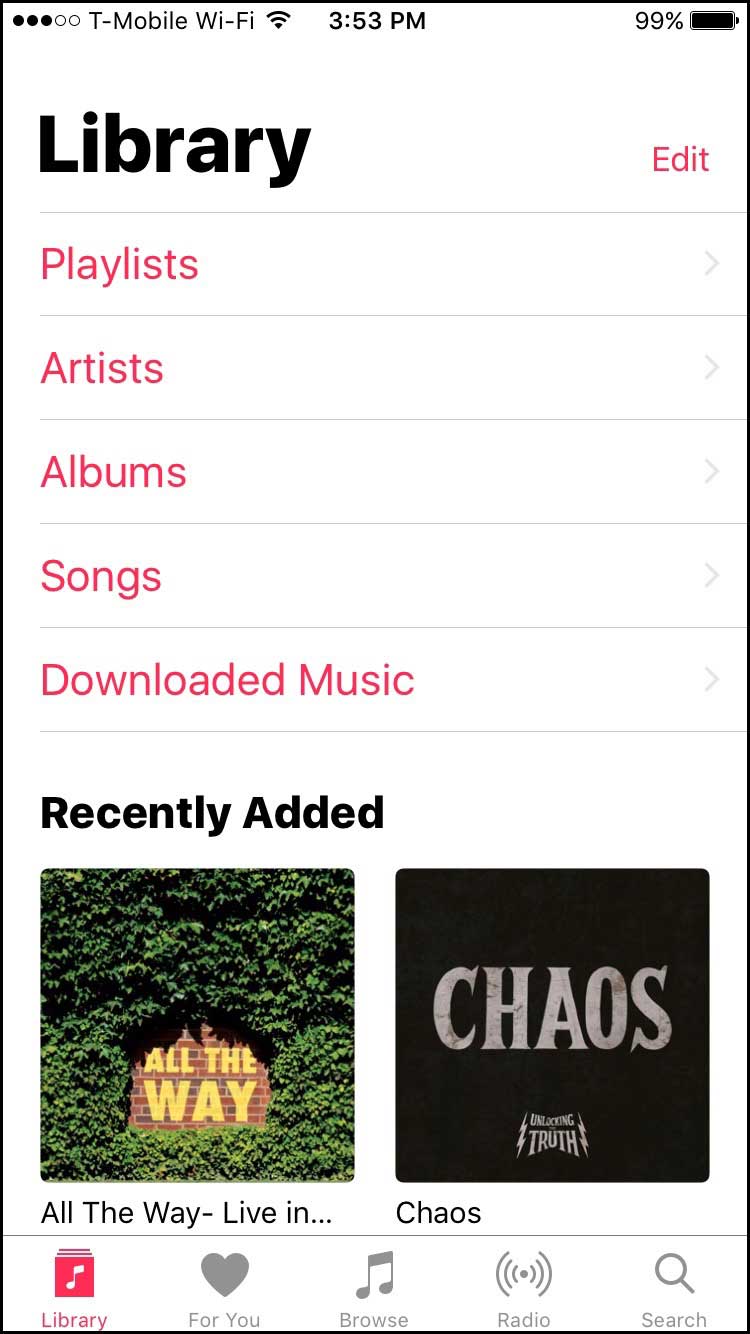
Music app in IOS 9 (left) versus in IOS 10 (right) with its billboard sized fonts.
Size Matters and So Does Space
To start, let's do a top-to-bottom simple comparison of previous versions of the opening screen on the IOS Music app, as seen on the left compared to the current verison, seen on the right. Beginning with IOS 9, we are able to see 3 albums at once as well as lengthier titles below them. We also have immediate access to our Library listings as well as Playlists, as both are considered as top-tier groupings, which makes sense since users pull songs from these 2 groups the most. Next, we are able to see 3 albums at once as well as somewhat lengthy titles in the Recently Added category. Below that we have a pull down menu (in this case, Songs) showing the first seven songs in the user's library. And below that we have the typical icons for Radio, Search, etc. that have changed very little between the 2 versions, aside from removing the Connect icon in IOS 10. Now, by just doing a simple comparison of the 2 versions, we can immediately see how space was used much more efficiently in IOS 9, compared to IOS 10. Not only have things become much more heavily enlarged and overblown, but the advantages are few and far between. Whereas as before we were able to see 3 of our albums, now we only see 2. But because of the new sizing, titles over 20 characters or more are cut off. Instead of the previous pull down menu system, which alllowed for other items to be seen, now we have the menus of Playlist, Artists, Albums, Songs and Downloaded Music taking over 50% of our real estate. As an interface designer myself, I would never consider having a menu system take anywhere near that amount of space. Look at the diverse amount of information presented on the left compared to the right. Having 50% of your menus being shown is not information. It is only a path to information.
Are we now designing a smartphone interface that has to be seen from 20 feet away?
Apple's San Francisco font has grown to gigantic proportions as well (as seen in the title of Library at the top). This, if anything, is one choice which has gotten me to pull my hair out. Do we need to have the Library title shown to us in 60 points? Are we now designing a smartphone interface that has to be seen from 20 feet away? What made Apple make such an erroneous choice? As much as I do not like using the tired cliché of What Would Steve Jobs Think of . . . in this situation, I have no choice but to ponder, "What Would Steve Jobs Think of This Choice?" Jobs, who had studied caligraphy and was an avid admirer of type and how it could do so much more than convey just words, would most likely have a strong opinion of such a use. A title or a listing should not be the dominant item on such a page or screen. Hopefully this will be something that Apple would consider in changing in future updates.
Where Did the Shuffle Icon Go?
But the latest changes are not just irritants to the overall design but to actual daily user interaction with the Music app. Take for instance a user's decision to shuffle or not to shuffle a song. How is this done? Well, in previous versions, the shuffle icon appears below the playing bar for easy access. And now? Well, that is something you are going to have to search for apparently. What we have now are icons to download the song from the Cloud, Airplay and a expanded menu item that gives us a wide range of other options, non of which include the much-used Shuffle menu itme. As seen in the left image below, while playing a song, that shuffle icon is no longer seen. It is something that took me over an hour to figure out. And I am an interface designer who has owned an iPhone from the very beginning. As seen in the right image, we are now supposed to drag up the album artwork to reveal the shuffle menu item along with the Up Next listings. Unfortunately, not very intuitive.
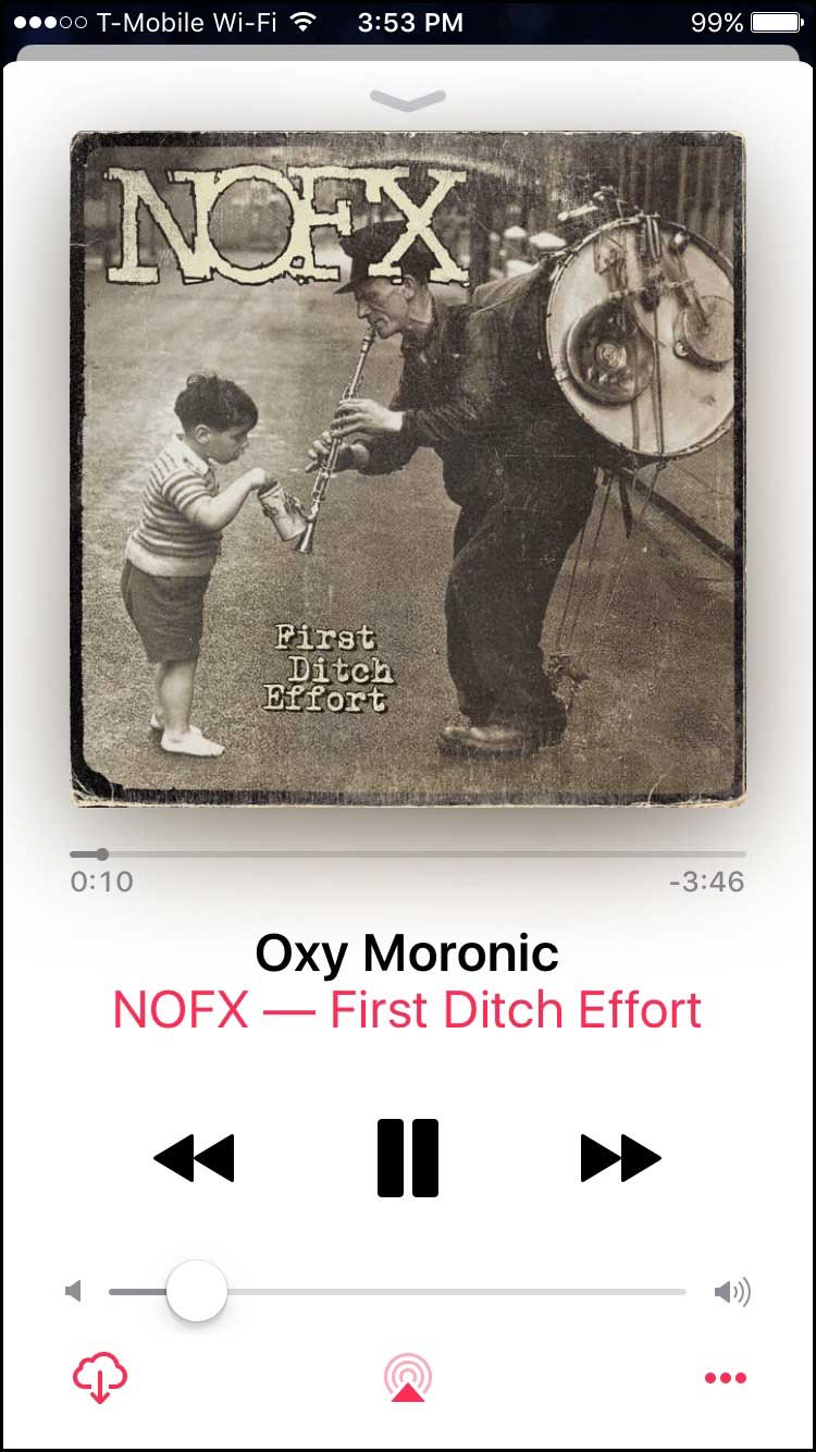
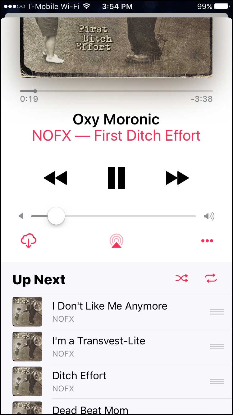
Music app's audio controls (left). To enable or disable shuffle mode, a user needs to swipe up (right).
These are just a few of the items that I believe Apple has gotten wrong. I did not want this article to get too bogged down in UI semantics and an Apple bitch-fest, but rather to get people thinking about how good clean design needs not only to convey an experience to the user, but also has to be a simple clutter-free experience when actually using an app. While I admire how clean and elegant Apple has designed several of their applications in the past, this unfortunately, is not one of them. Also, having to incorporate the subscription-based Apple Music user interface elements into the mix doesn't help matters. And speaking of Apple Music, why would Apple name their subscription-based service the same exact name as their app? It seems to me this just adds that much more to the conversation of confusion at Apple these days. Don't get me wrong – I believe Apple makes some of the best products out there. But when it comes to iTunes and the IOS app Apple Music, things sometimes need to have a little more foresight then seeing how big fonts can be and how many menus we can dump into a screen.
Next week, I'll be talking about one of my favorite books, Katharine Harmon's The Map as Art.