Showcasing the Art in Cartography
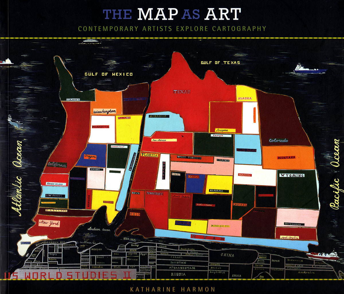
US World Studies II, by Jules De Balincourt
Katharine Harmon's The Map as Art
Even though Katharine's Harmon'sThe Map as Art came out almost 7 years ago, I wanted to take another look at this seminal book that takes a look at art, geography, population displacement and yes, even politics. As a great fan of Katherine Harmon's previous book, You are Here: Personal Geographies and Other Maps of the Imagination, it seemed relevant to take another look at The Map as Art in this day and age of mapping our own country into just blue and red zones.
While there are various areas where Katharine Harmon delves into political discourse and deals with the world of wars within the book (the first chapter is titled Conflict and Sorrow) it also discovers areas of personal exploration. In Noriko Ambe’s “Flat File Globe Red Tank A” (2007), drawers filled with undulating typographical layers of cut paper are meant to convey the artist’s “nuances of emotions, habits and biorhythms” — without resorting to Google maps or having to pull out your grandfather's Atlas.
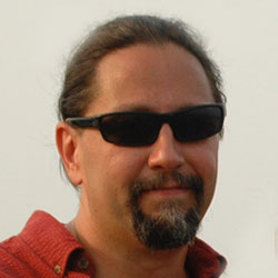
Joao Machado's Swimming, 2007. Collage using vintage maps.
A Map for All Emotions
From very early on, artists have used maps or map iconography to interpret their works of art: from Salvador Dali, Max Ernst, Yoko Ono, Joseph Cornell to one of my favorites, Joan Miró. As guest essayist Gayle Clemmons states in the book's introduction: “Is there any motif so malleable, so ripe for appropriation, as maps? They can act as shorthand for ready metaphors: seeking location and experiencing dislocation, bringing order to chaos. ”
“Is there any motif so malleable, so ripe for appropriation, as maps? They can act as shorthand for ready metaphors: seeking location and experiencing dislocation, bringing order to chaos . . .”
But something being just a physical location or a marker on some landowner's territory is not the only maps seen in this collection. We see psychological maps, emotional maps and maps of the human brain. All of these come to life and presented in a clear and uncluttered manner by the book's designer, Jane Jeszeck. The book is divided into 7 chapters with each one taking a different view and perspective of what a map is and how it effects people, the earth, animals, emotions and yes, politics. They are: Conflict and Sorrow, Global Reckoning, Animal, Vegetable, Mineral, Persoanl Terrain, You Are Here, Somewhere, Inner Visions and finally Dimension/Deletion which allow for an imaginative journey through the book as seen through various artists working across all mediums.
Art as Cartography and Cartography as Art
As many can tell you, we graphic designers tend to fall back on old tried and true methods and ways to display information, especially when it comes to infographics. Information graphics or infographics are graphic visual representations of information, data or knowledge intended to present information quickly and clearly. They can improve cognition by utilizing graphics to enhance the human visual system's ability to see patterns and trends. I have created many infographics over the years and several of these tend to involve maps. Maps of the world showing technical trends or maps of particular countries presenting the viewer with data of their GDP. But when it comes to inspiration or a road map on how to display such information, we graphic designers frequently rely on dry data-driven information or infographics of the past to grasp our given task. But with something like The Map as Art, I find a whole new world of inspiration that takes me beyond the data driven facts.
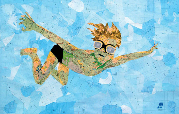
Al Weiwei's World Map, 2006. A material and wooden base structure constructed of two thousand layers of cotton.
For example, in Sarah Trigg's Mutation Sites, you can find beauty and inspiration from her use of color, design and style in her images. This style is reminiscent of earlier Japanese works by Katsushika Hokusai, with her thin graphic lines and bold colors against a somewhat sullied white background. But then you realize that are looking at the horific scorched earth of Kuwait's burning oil fields. In these gouache on paper paintings, you are left with an understanding of its content, its implication, but also with its beauty – all within a petite 5 by 7 inch painted panel. It makes you see art not only as an important tool for those wanting to express themselves to the world, but also as how the world is seen and portrayed in something as dry and conventional as a map. Information doesn't have to come across as dry and monotonous, like something that came out of statistician's office or spit out of a database. It can be something that you are horrified at and in awe of – all at the same time, while still conveying some bit of information and truth. And isn't that something that we can all use today?
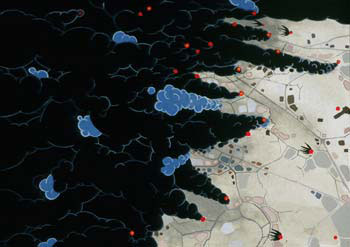
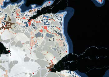
Mutation Sites by Sarah Trigg depicts Kuwait's buring oil fields during the first Gulf War.